Dimensional letters and precision-cut metal signage help a business look established, memorable, and easy to recognize before a customer ever walks through the door. For storefronts, offices, lobbies, showrooms, and branded interiors, ProPrint Signs focuses on signage that feels intentional, durable, and aligned with the way a brand wants to be seen. The goal is simple: turn a name, logo, or message into a physical feature that strengthens brand presence every day.
What makes premium signage feel premium?
Premium signage feels premium when it combines visual clarity, quality materials, precise fabrication, and smart placement. A sign does not need to be overly complex to make an impression; it needs to be well proportioned, easy to read, and made with details that support the brand rather than distract from it.
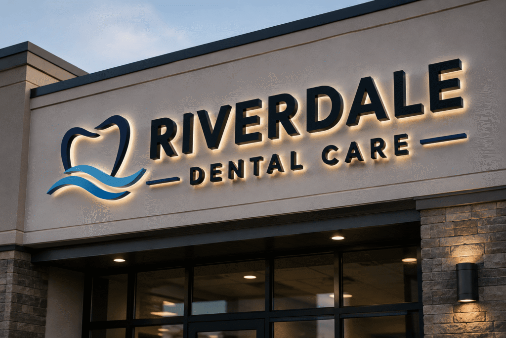
Dimensional letters add shadow, depth, and structure, giving a flat wall or façade more visual weight. Precision-cut metal adds clean edges, crisp forms, and a refined finish that can suit both modern and traditional spaces. Together, dimensional letters and precision-cut metal signage for brand presence create a more permanent, professional look than temporary graphics or generic panels.
The best results come from treating signage as part of the customer experience. A lobby sign can reassure a visitor that they are in the right place. A storefront sign can help a passerby remember a brand name. A reception wall can turn an ordinary interior into a branded environment.
Dimensional letters create depth, visibility, and recognition
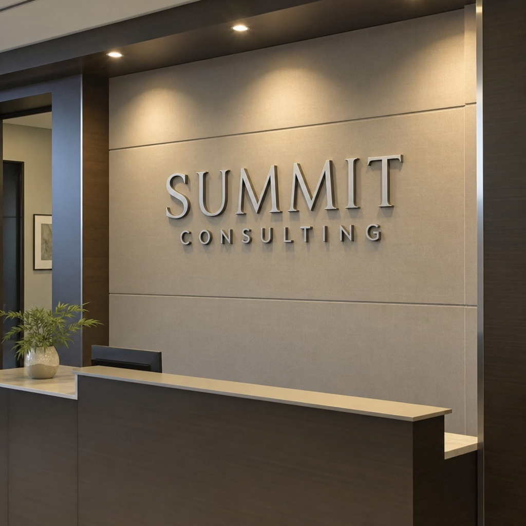
Dimensional letters are raised letterforms, logos, or design elements mounted to a surface rather than printed flat. That raised profile gives the sign a sense of substance. Light naturally interacts with the edges and surfaces, creating highlights and shadows that make the sign stand out from its background.
For businesses, this depth matters because it makes branding easier to notice and easier to remember. A company name in dimensional lettering can feel more established in a lobby, more polished on an exterior wall, and more intentional in a retail environment. The design can be bold and high-contrast, subtle and elegant, or somewhere in between, depending on the brand.
Dimensional letters can also work across many settings. They are commonly used for:
- Reception areas, where the sign introduces the brand to visitors, clients, and employees.
- Storefronts, where visibility and curb appeal influence first impressions.
- Conference rooms or branded walls, where a logo reinforces identity during meetings and presentations.
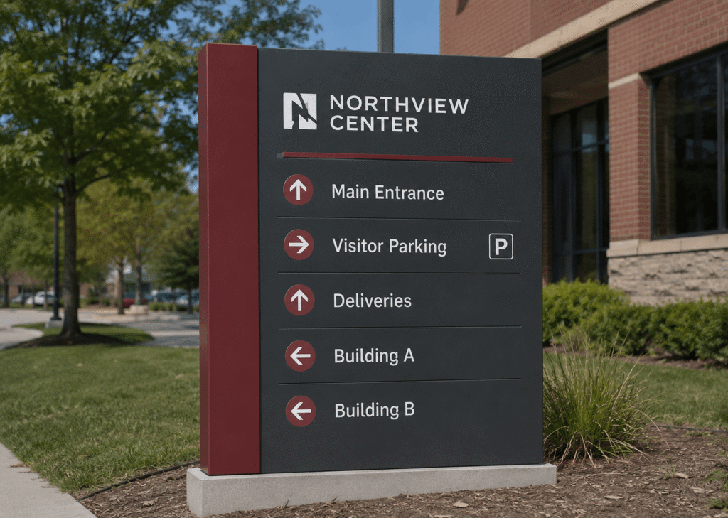
- Wayfinding accents, where raised elements can support a cohesive interior system.
- Showrooms and sales environments, where premium presentation can help products and services feel more considered.
The practical advantage is flexibility. Dimensional signage can be designed to match the scale of a wall, the tone of a space, and the personality of a brand without relying on one-size-fits-all solutions.
How does precision-cut metal improve a sign?
Precision-cut metal improves a sign by creating clean lines, consistent shapes, and a finished appearance that communicates care. When letters, logos, or panels are cut accurately, the result looks sharp from a distance and refined up close. That combination is especially valuable for brands that want their signage to feel trustworthy, premium, and built to last.
Metal also brings a distinct visual character. Depending on the design direction, it can feel sleek, industrial, upscale, minimal, or bold. A brushed or polished appearance can support a professional office environment, while painted or coated metal can create strong brand color alignment. Even simple letterforms can become visually striking when the material and finish are chosen well.
Precision matters most in the details people may not consciously notice but still respond to. Uneven edges, awkward spacing, or poor alignment can make a sign feel off, even when the general idea is good. Clean cutting and careful installation help the finished piece look deliberate, balanced, and appropriate for the space.
Signage should support the space, not fight it
Strong signage does more than display a name. It works with the architecture, lighting, wall color, viewing distance, and customer flow. A sign that looks excellent in one environment may need adjustments to work in another, which is why planning matters before production begins.
For example, a lobby wall with soft lighting may benefit from dimensional letters with enough depth to create subtle shadow. A busy storefront may need stronger contrast and larger letterforms for readability. A corporate interior may call for restrained finishes that feel polished without overpowering the room.
Before choosing a final direction, it helps to consider these practical questions:
- Where will people view the sign from? A sign seen from the street needs different sizing and contrast than one viewed from a few feet away.
- What should the sign communicate emotionally? Modern, approachable, premium, bold, creative, and dependable all suggest different design choices.
- How does the sign relate to the surrounding materials? Brick, glass, painted drywall, stone, and wood each affect how the sign will appear.
- Will lighting change the look? Natural light, overhead lighting, and shadows can all influence readability and finish.
- Does the sign match existing brand assets? Letter spacing, logo proportions, colors, and finishes should feel consistent with the broader identity.
This planning stage helps prevent a common mistake: choosing a sign because it looks good by itself, rather than because it works in the real environment where customers will see it.
Where premium dimensional and metal signage has the most impact
Dimensional letters and precision-cut metal signage are especially effective in places where first impressions matter. They are not limited to one industry or one type of building. Any organization that depends on trust, recognition, and a polished customer experience can benefit from a sign that feels permanent and professionally made.
A few high-impact uses include:
- Exterior building signs: Help customers locate the business and establish a confident street presence.
- Lobby logo signs: Create a polished welcome moment and reinforce the brand immediately.
- Retail feature walls: Add depth and brand personality without cluttering the space.
- Professional offices: Support credibility in reception areas, hallways, and client-facing rooms.
- Restaurants and hospitality spaces: Strengthen atmosphere while keeping the brand visible and memorable.
- Multi-location businesses: Create consistency across different spaces while allowing for site-specific adjustments.
For growing brands, this kind of signage can also create continuity. The same visual identity used on a website, business card, vehicle graphic, or printed material can be translated into a physical sign that customers experience in person.
A successful sign starts with the right decisions
Premium signage works best when the creative and practical choices support each other. A beautiful material will not solve poor readability. A large sign will not feel premium if the spacing is awkward. A dramatic finish may lose impact if it clashes with the surrounding space.
When working through a signage project, keep the process grounded in a few essentials:
- Prioritize legibility first. The name or logo should be easy to understand at the intended viewing distance.
- Choose materials with purpose. Metal, acrylic, and other dimensional elements each create a different impression.
- Respect brand consistency. Colors, proportions, and typography should align with the existing identity whenever possible.
- Think about maintenance. A sign should suit the environment and remain presentable with reasonable care.
- Plan installation carefully. Placement, alignment, mounting, and surface compatibility all affect the final result.
ProPrint Signs brings these considerations into the production conversation so the finished piece is not just attractive, but useful. The right sign should help people find you, recognize you, and remember you.
The takeaway for businesses building stronger brand presence
Dimensional letters and precision-cut metal signage for brand presence offer a practical way to make a business feel more visible, more polished, and more established. They turn everyday spaces into branded touchpoints and help customers form a stronger impression from the moment they arrive.
For businesses ready to upgrade a storefront, lobby, office, or customer-facing interior, ProPrint Signs can help shape a sign that looks intentional and supports the brand in the real world. Premium signage is not just decoration; it is a visible expression of how seriously a business takes its identity.