A strong wayfinding sign system helps people understand where they are, where they need to go, and what to do next. For campuses, offices, and hospitals, that clarity can reduce stress, missed turns, repeated questions, and delays. ProPrint Signs helps organizations think through wayfinding as a connected experience, not just a collection of signs placed wherever space is available.
What makes wayfinding signage effective?
Effective wayfinding signage is clear, consistent, visible, and positioned at the exact moments when people need to make decisions. It works because each sign has a job: orient the visitor, confirm they are on the right route, identify a destination, or communicate an important rule. When those signs share the same language, visual style, and placement logic, people can move with more confidence.
That matters in complex environments. A visitor arriving at a medical building may be anxious. A new employee may be learning a multi-floor office. A student or guest may be navigating a large campus for the first time. In each case, signs should lower the mental effort required to move through the space.
Wayfinding starts before the first sign is made
The best systems begin with planning. Before choosing materials, colors, or mounting methods, it helps to map the journey from the visitor’s point of view. Where do people enter? Where do they pause? Where do they get confused? Which destinations are most requested?
ProPrint Signs can support this process by helping identify the main decision points across a property. Those points often include parking areas, entrances, lobbies, elevator banks, corridors, stairwells, department entrances, and reception desks. When each location is considered as part of a complete path, the signage becomes more useful and less cluttered.
A practical planning process may include:
- Identify user groups. Consider visitors, staff, vendors, patients, students, tenants, and delivery drivers.
- Map common routes. Focus on the paths people take most often, especially from entrances to high-priority destinations.
- Mark decision points. Place signs where someone must choose a direction, confirm a route, or identify a room or department.
- Simplify destination names. Use familiar, plain-language terms instead of internal abbreviations whenever possible.
- Create consistency. Keep naming, arrows, typography, colors, and icon use aligned across the system.
Sign types that work together as a system
Wayfinding is most effective when different sign types reinforce one another. A single lobby directory cannot solve every navigation issue. Likewise, room signs alone cannot help someone understand how to reach the correct hallway. A complete system creates a sequence of guidance from arrival to destination.
Common elements include:
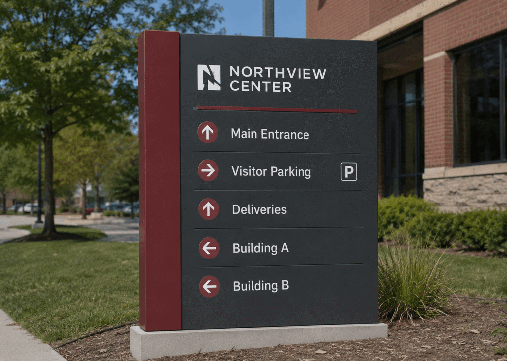
- Exterior directional signs that guide drivers and pedestrians to buildings, entrances, parking, loading zones, or visitor areas.
- Monument and building identification signs that confirm someone has reached the right facility.
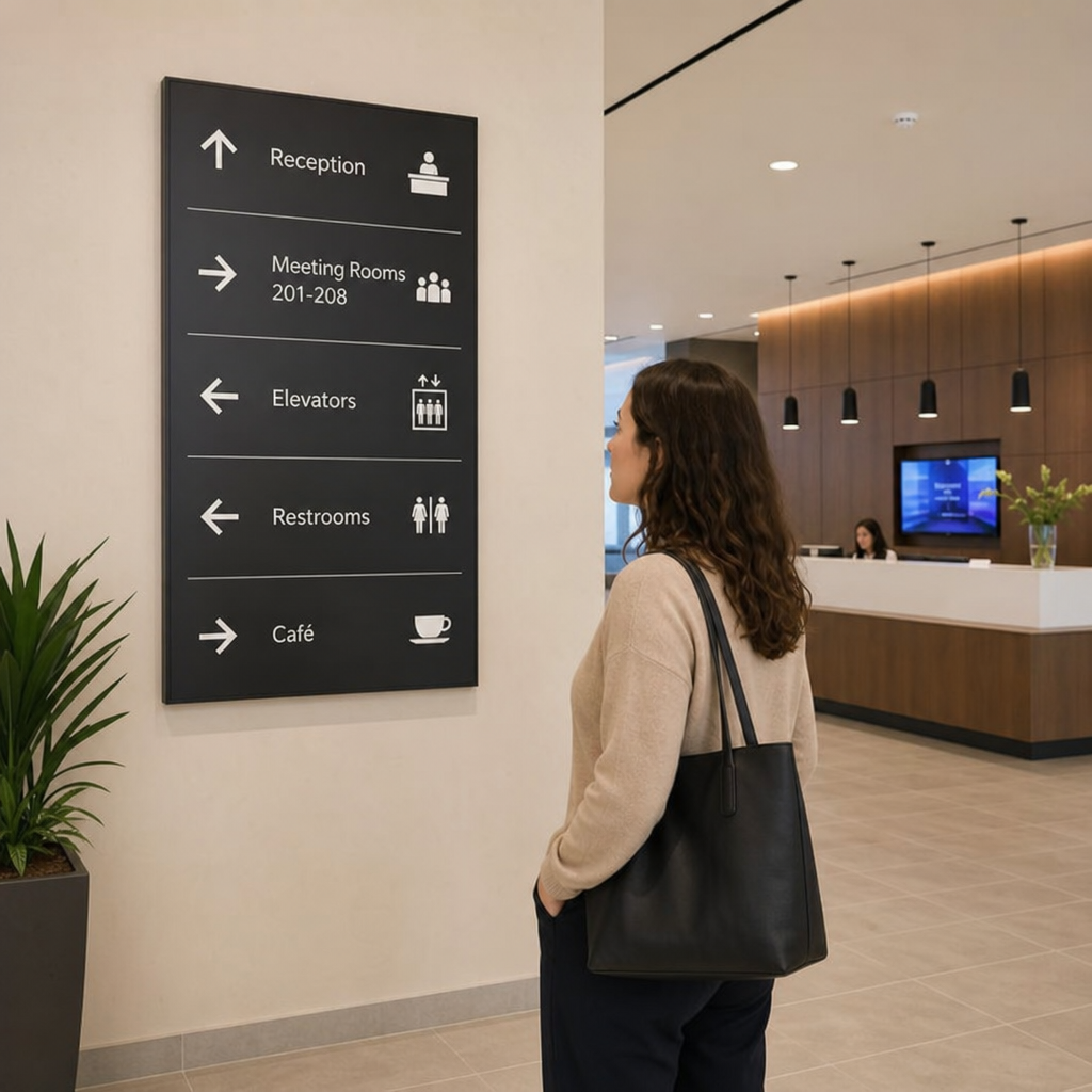
- Lobby directories that give a big-picture view of departments, floors, suites, or services.
- Directional signs that point toward major destinations at intersections and corridor changes.
- Room identification signs that label offices, meeting rooms, departments, restrooms, and support spaces.
- Regulatory and safety signs that communicate access rules, emergency routes, restrictions, and required notices.
For wayfinding signage systems for campuses, offices, and hospitals, these sign types should feel like one family. They do not need to be identical, but they should clearly belong together. That visual consistency helps people trust the information and recognize guidance quickly as they move.
Why do campuses, offices, and hospitals need different wayfinding priorities?
Campuses, offices, and hospitals all need navigation support, but each environment creates different challenges. Campuses often involve multiple buildings and outdoor routes. Offices may need clear tenant, department, and meeting-room identification. Hospitals and healthcare facilities usually require calm, direct guidance for people who may be under stress.
On a campus, exterior signs and building identification often carry much of the workload. Visitors may need to find parking first, then a building, then a specific office or event location. Outdoor durability, visibility from a distance, and clear naming are especially important.
In offices, the goal is often efficiency and professionalism. Good signage helps clients find reception, employees find shared spaces, and vendors locate the right delivery or service area. It also supports the brand experience by making the workplace feel organized and intentional.
In hospitals, clarity is essential. Department names, elevator instructions, accessible routes, and floor-level guidance should be easy to understand. Color coding may help in some settings, but only when it is used consistently and supported by readable text.
Design choices that reduce confusion
Wayfinding design should be attractive, but it also has to be practical. A beautiful sign that cannot be read quickly is not doing its job. The strongest systems balance brand style with legibility, contrast, spacing, and simple information hierarchy.
Helpful design principles include:
- Use readable typography. Choose clear fonts and avoid overly decorative styles for directional information.
- Prioritize contrast. Text should stand out from the background in varied lighting conditions.
- Limit the message. Too much information on one sign slows people down.
- Use arrows consistently. Arrow placement and direction should be predictable across the property.
- Group destinations logically. Organize by floor, department, building, or route so users can scan quickly.
- Keep terminology consistent. If one sign says “Patient Registration,” another should not call it “Admissions” unless both terms are intentionally explained.
Material choices matter too. Interior office signs may have different needs than exterior campus signs exposed to weather. A practical plan considers durability, cleaning, mounting surfaces, lighting, and the level of update flexibility needed over time.
A simple checklist before production
Before signs are fabricated, it is worth reviewing the system carefully. Small inconsistencies can become major points of confusion once signs are installed.
Use this checklist to guide the final review:
- Are destination names accurate and approved by the right stakeholders?
- Are arrows pointing in the correct direction from the viewer’s location?
- Are signs placed before the decision point, not after it?
- Can text be read from a practical viewing distance?
- Are accessible routes clearly marked where needed?
- Do exterior and interior signs connect into one continuous journey?
- Is there a plan for future updates when departments, tenants, or rooms change?
This is also a good moment to walk the routes in person. Moving through the space like a first-time visitor often reveals missing signs, unclear language, or places where a confirmation sign would help.
How ProPrint Signs helps turn planning into a finished system
A wayfinding project involves more than printing panels. It requires coordination between layout, design, materials, fabrication, and installation. ProPrint Signs can help translate a navigation plan into signs that are practical for the environment and aligned with the organization’s visual style.
The process typically benefits from clear communication early. Share maps, floor plans, brand guidelines, destination lists, and known problem areas. If staff frequently hear the same navigation questions, those questions are valuable clues. They show where the current system may be incomplete or unclear.
For organizations exploring wayfinding signage systems for campuses, offices, and hospitals, the goal should be simple: make every step feel easier for the person moving through the space. When signs are planned as a connected system, they can support safety, improve first impressions, and help people arrive with less frustration.
Clearer navigation creates a better experience
Good wayfinding is easy to overlook when it works well. People simply find the entrance, choose the right hallway, reach the correct floor, and arrive where they need to be. That quiet efficiency is exactly the point.
By planning routes, messages, placement, and design together, organizations can create signage that feels helpful rather than overwhelming. ProPrint Signs brings a practical approach to that process, helping turn confusing spaces into places that are easier to understand, easier to move through, and more welcoming from the first arrival.