A great sign should work just as hard after sunset as it does during the day. For storefronts, offices, restaurants, property entrances, and service businesses, lighting can turn dimensional lettering into a polished brand feature that attracts attention, improves readability, and creates a more professional first impression. ProPrint Signs helps businesses understand how backlit letter signage and illuminated dimensional letters for nighttime visibility and brand impact can support both practical visibility and a stronger visual identity.
What makes backlit and halo-lit letters different?
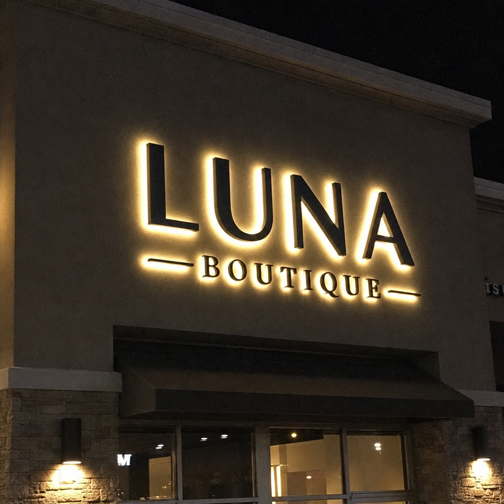
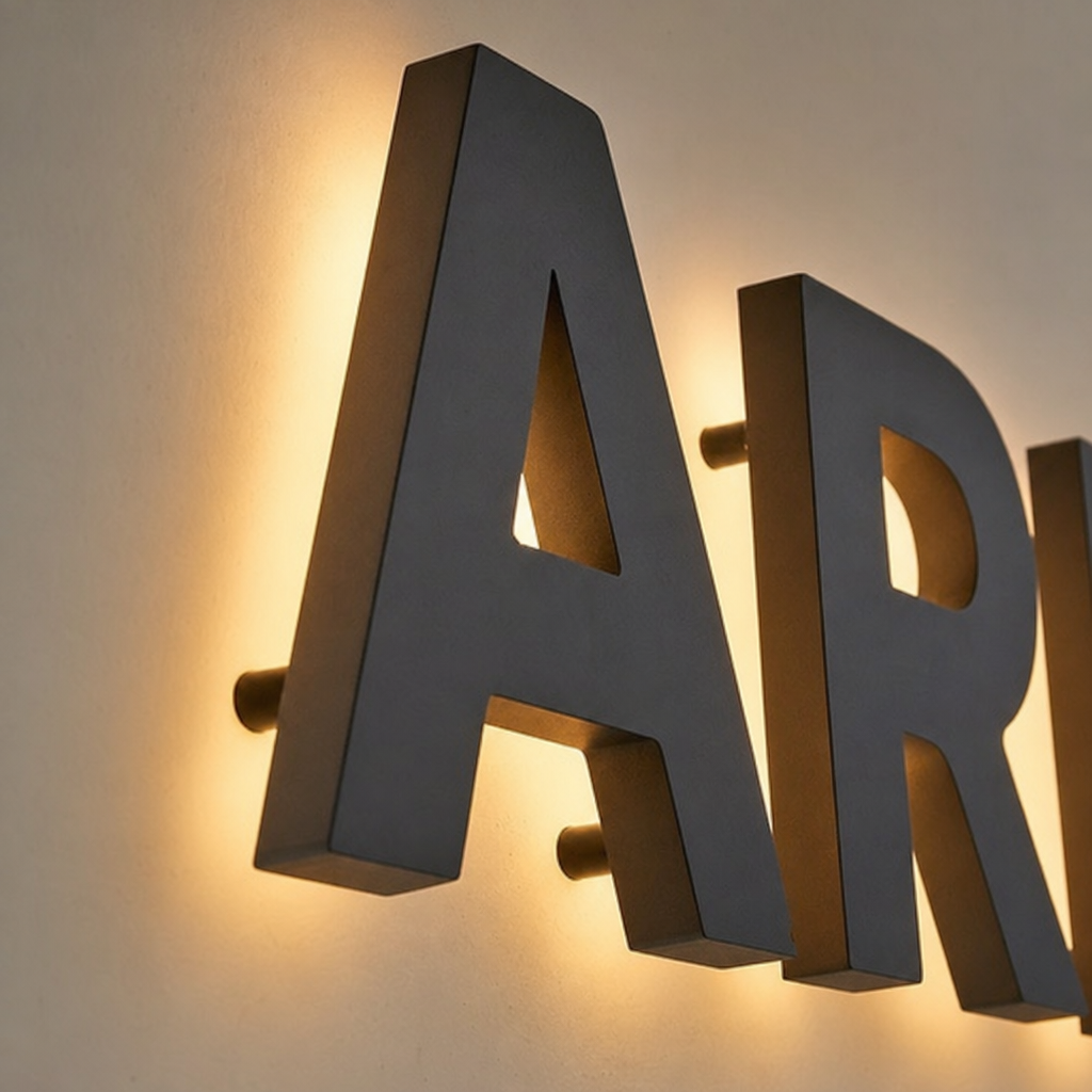
Backlit and halo-lit letters are dimensional sign letters designed so light glows from behind each character rather than shining directly through the face. This creates a soft outline, or “halo,” around the letters, helping the sign stand out from the wall while keeping the look refined and upscale.
Unlike a flat printed sign, illuminated dimensional letters add depth, shadow, and contrast. During the day, the letter material, color, and mounting style create a clean architectural look. At night, the lighting adds a second layer of visibility, making the sign easier to spot from the street, sidewalk, or parking lot without feeling overly bright.
Lighting changes how customers notice your business
A sign does more than display a name. It helps people find you, remember you, and decide whether your business feels credible before they ever walk inside. Lighting strengthens that job by making your sign active in low-light conditions, evening traffic, cloudy weather, and shaded locations.
For many businesses, the most valuable impressions happen outside traditional daylight hours. A restaurant may need visibility during dinner service. A medical office may want patients to feel confident arriving for an early or late appointment. A retail shop, fitness studio, hotel, or entertainment venue may depend on evening foot traffic. In each case, illumination helps the sign remain useful when a non-lit sign would fade into the background.
The visual benefit matters, too. Halo lighting often feels elegant because it separates the letters from the wall with a controlled glow. That effect can make a brand feel established, modern, and intentional.
Why choose illuminated dimensional letters for your location?
Illuminated dimensional letters are a strong choice when you want your sign to be visible, durable, and visually aligned with the character of your space. They can be adapted for many exterior and interior applications, from building-mounted signs to lobby walls and reception areas.
The best reason to choose this style is balance. You get the substance of dimensional signage and the added performance of illumination without relying on a loud or cluttered design. For businesses that want to look professional rather than flashy, backlit letters can create a strong presence with a cleaner finish.
Common benefits include:
- Improved nighttime readability: The glow behind each letter helps define the shape of the text in darker conditions.
- Stronger brand presence: Depth, light, and shadow make the sign feel more permanent and premium.
- Better visibility from multiple angles: Raised letters are easier to notice as people approach from different directions.
- A polished architectural look: The sign can complement the building rather than appearing like an afterthought.
- Flexible design options: Letter size, color, material, finish, spacing, and lighting temperature can be adjusted to fit the brand.
Backlit letter signage supports both function and style
The most effective signs are not just attractive; they solve real communication problems. Backlit letter signage and illuminated dimensional letters for nighttime visibility and brand impact help customers identify your location quickly while reinforcing the tone of your business.
A warm white glow may create a welcoming, boutique feel. A cooler white may appear crisp, modern, and corporate. The face of the letters might be a dark finish for contrast, a metallic finish for sophistication, or a color that matches brand standards. These choices influence how people interpret the business before they read a single word on the door.
This is where planning matters. A sign that looks excellent in a close-up design proof still needs to perform in the real world. Wall color, viewing distance, nearby lighting, traffic speed, and surrounding signs all affect how the finished piece will read. ProPrint Signs can help translate a brand concept into signage that looks right on the actual building, not just on a screen.
Design choices that make the glow work harder
Halo-lit letters look simple when they are done well, but that simplicity depends on good design decisions. The goal is to create enough contrast for visibility while keeping the lighting even and intentional.
Key design considerations include:
- Letter size and stroke width Thin or overly delicate letterforms may not hold lighting as effectively from a distance. Bolder shapes often provide cleaner readability, especially on exterior walls.
- Mounting depth The space between the letter and the wall affects the halo effect. Too close, and the glow may feel tight. Too far, and it may lose definition.
- Wall surface and color A smooth, light-colored wall reflects illumination differently than a dark brick, stone, or textured surface. The background should be considered part of the sign design.
- Lighting temperature Warm, neutral, and cool light each create a different impression. The right choice depends on your brand personality and the surrounding environment.
- Letter finish Matte, gloss, brushed metal, painted, and acrylic finishes all interact with daylight and ambient light differently. The finish should support both daytime and nighttime visibility.
Where do backlit letters make the biggest impact?
Backlit letters make the biggest impact in locations where visibility, brand perception, and after-dark recognition all matter. They are especially useful on building facades, storefronts, monument signs, reception walls, and branded interior spaces where a premium look supports the customer experience.
For exterior use, they help a business stand out along a street, in a shopping center, or on a shared commercial property. For interior use, they can turn a lobby wall into a branded focal point that feels finished and memorable. In both settings, lighting adds dimension and helps the sign feel integrated into the space.
They are often a good fit for:
- Restaurants, cafés, and bars that operate after dark
- Retail storefronts in busy shopping areas
- Medical, dental, and wellness offices that want a calm, professional look
- Corporate offices and headquarters
- Hotels, salons, spas, and fitness studios
- Property management, real estate, and mixed-use developments
A practical checklist before starting your sign project
Before choosing backlit or halo-lit letters, it helps to gather a few details about your location and goals. This makes the design process smoother and helps avoid choices that look good in theory but underperform on-site.
Use this checklist as a starting point:
- Confirm where the sign will be installed and how people will approach it.
- Think about whether the sign needs to be seen mainly by drivers, pedestrians, or both.
- Review your brand colors, logo files, and any existing sign standards.
- Consider the wall material, available space, and surrounding lighting.
- Decide whether the desired look is bold, elegant, modern, warm, or understated.
- Note any landlord, property, or local sign requirements that may apply.
- Plan for both daytime appearance and nighttime visibility.
A professional sign partner can help refine these details and recommend practical options based on the installation environment.
The right sign feels intentional day and night
A well-designed illuminated sign should not feel like a decoration added at the end. It should feel like part of the building, part of the brand, and part of the customer’s first experience with your business. Backlit and halo-lit letters accomplish this by combining structure, lighting, and clear visual communication.
If your current sign disappears after sunset or does not reflect the quality of your business, illuminated dimensional letters may be a smart next step. With thoughtful design and proper placement, your sign can guide customers, strengthen recognition, and create a professional impression long after daylight fades. Contact ProPrint Signs to get started.