Clear directional and parking signs help people move through a property with less confusion, fewer delays, and a better first impression. For businesses, campuses, residential communities, medical offices, retail centers, and industrial sites, the right signs do more than point the way — they support safety, organization, and day-to-day efficiency. ProPrint Signs helps property teams create practical signage systems that guide drivers, pedestrians, visitors, vendors, and staff from arrival to departure.
Why does directional signage matter on a property?
Directional signage matters because people make decisions quickly when they are driving, parking, walking, or looking for an entrance. If a visitor cannot tell where to turn, where to park, or which door to use, the experience becomes frustrating before they ever reach the front desk. Strong wayfinding reduces hesitation, keeps traffic flowing, and helps every part of the property feel more intentional.
This is especially important for locations with multiple buildings, shared lots, service roads, gated access, delivery areas, or separate visitor and employee parking. A sign at the right moment can prevent a wrong turn, keep delivery vehicles out of customer areas, and help first-time guests feel confident. Directional signage for properties: parking, entrances, exits, delivery routes, and visitor guidance all work together as one system, not as isolated signs.
When signs are missing or inconsistent, people create their own paths. They circle the lot, stop in travel lanes, block entrances, or walk into the wrong building. A well-planned signage system helps prevent those small disruptions from becoming daily operational headaches.
A good parking sign starts before the parking space
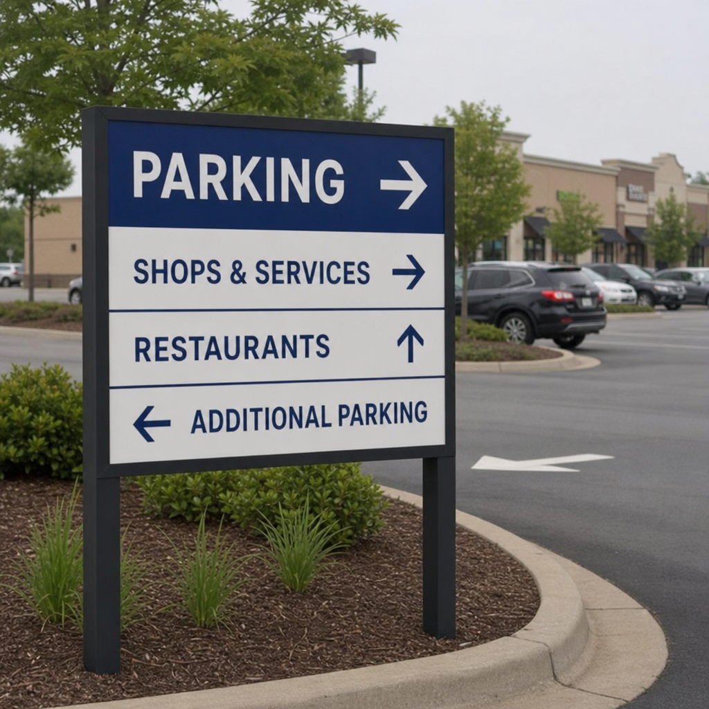
Parking signs are often treated as labels, but they work best when they guide drivers from the street to the right space. The experience begins with entry signs, continues with lane and lot guidance, and ends with clear instructions for where specific users should park.
For example, a commercial property may need signs for visitor parking, employee parking, accessible parking, reserved spaces, short-term pickup, loading zones, and no-parking areas. Each sign should be easy to read while moving, placed where a decision is made, and designed with enough contrast to stand out in different lighting conditions.
A stronger parking sign plan usually includes:
- Entry direction signs that tell drivers where to turn as soon as they enter the property.
- Parking area identifiers that separate visitor, tenant, customer, staff, or resident parking.
- Restriction signs that communicate towing, fire lane, loading, or time-limit rules clearly.
- Accessible parking signs placed with careful attention to visibility and compliance needs.
- Exit signs that help drivers leave without cutting through pedestrian or service areas.
The goal is not to add as many signs as possible. The goal is to place the right signs in the right sequence so drivers receive information before they need it.
Entrances, exits, and decision points need extra clarity
Most traffic issues happen at decision points. These are the moments when someone must choose whether to turn left or right, continue straight, stop, enter, exit, park, or look for another route. If the sign is too small, too late, or unclear, the driver may slow down suddenly or make an unsafe maneuver.
Entrance signs should confirm that a visitor has arrived at the correct place. Exit signs should be equally clear, especially in lots with one-way circulation, gates, or multiple driveways. If a property has separate entrances for customers, residents, patients, trucks, or employees, signs should make that distinction early enough to prevent last-minute corrections.
Good directional signs use simple language. “Visitor Entrance,” “Deliveries,” “Exit Only,” “Main Office,” and “Parking Garage” are usually more useful than long messages. Design also matters: consistent colors, readable fonts, arrows, and spacing help people understand the message quickly.
Delivery routes should protect the visitor experience
Delivery and service traffic can easily disrupt a property if it is not clearly directed. Trucks need room to turn, drivers need to find loading areas quickly, and property teams need to keep service activity away from front entrances whenever possible. Directional signs make this easier by separating operational traffic from guest traffic.
For offices, retail properties, apartment communities, schools, and healthcare facilities, delivery route signs can point vendors toward loading docks, service entrances, receiving areas, trash enclosures, or maintenance access roads. They can also discourage trucks from using customer parking aisles, pedestrian-heavy zones, or restricted fire lanes.
A practical delivery signage plan may include:
- Advance notice at the property entrance so drivers know where delivery access begins.
- Route arrows along service roads to reduce stopping and reversing.
- Loading zone signs that define where deliveries are allowed.
- Restricted access signs to keep non-service vehicles out of operational areas.
- Exit guidance so delivery vehicles leave by the safest, most efficient route.
This kind of signage is not only helpful for vendors. It also protects the appearance and flow of customer-facing spaces.
What makes a directional sign easy to follow?
A directional sign is easy to follow when it gives the right information, at the right time, in a format people can understand quickly. The message should be short, the arrow should be unmistakable, and the sign should be visible from the normal approach angle. If someone has to slow down too much to interpret it, the sign is probably doing too much.
The most effective signs are designed around real movement patterns. That means considering how drivers enter, where pedestrians cross, where visitors hesitate, and where traffic naturally backs up. ProPrint Signs can help translate those everyday patterns into signs that feel simple to users while supporting the property’s operations.
Useful design considerations include:
- Legibility: Use clear type, strong contrast, and appropriate letter size.
- Consistency: Keep colors, arrows, icons, and naming conventions aligned across the property.
- Placement: Install signs before the decision point, not after it.
- Durability: Choose materials suited to weather, sunlight, traffic, and maintenance needs.
- Simplicity: Avoid crowding one sign with too many directions or instructions.
A sign should answer one immediate question: “Where do I go next?” When it does that well, the entire property becomes easier to navigate.
Visitor guidance supports trust and accessibility
Visitors often judge a property before they speak to anyone. If the route from the entrance to parking to the correct door is smooth, the business feels prepared and welcoming. If the route is confusing, even a well-run organization can appear disorganized.
Visitor guidance signs can include lobby directions, building numbers, pedestrian paths, check-in instructions, suite numbers, and signs for accessible entrances. They are especially valuable for properties that welcome first-time visitors, patients, clients, students, tenants, or event guests.
Clear signage also supports accessibility by reducing unnecessary walking, confusion, and backtracking. While specific requirements depend on the property and sign type, the practical goal is always the same: help people reach their destination with confidence and dignity.
Planning signs as a system creates better results
One sign can solve one problem, but a signage system creates a smoother experience across the whole property. Instead of waiting until confusion appears, property managers can look at the full journey: arriving from the street, entering the property, finding parking, walking to the right door, navigating service areas, and exiting safely.
Before ordering new signs, it helps to walk or drive the property as if you are visiting for the first time. Notice where you slow down, where labels are missing, where arrows conflict, and where different user groups overlap. These observations can reveal the best opportunities for improvement.
A simple planning checklist includes:
- Identify the main groups using the property: visitors, employees, tenants, residents, vendors, and emergency access.
- Map the most common routes for each group.
- Mark entrances, exits, parking zones, delivery areas, walkways, and restricted spaces.
- Look for confusing intersections, blind spots, or places where people often ask for directions.
- Standardize wording so the same destination is named the same way everywhere.
- Review sign size, mounting height, visibility, and material needs before production.
This approach keeps the finished signs practical, cohesive, and easier to maintain over time.
ProPrint Signs helps properties communicate clearly
Directional and parking signs are everyday tools that make a property easier to use. They reduce confusion, support safety, improve traffic flow, and create a more professional experience for everyone who arrives on-site. From parking areas and entrances to delivery routes and visitor guidance, thoughtful signage helps people move with purpose instead of guessing.
ProPrint Signs works with organizations that need clear, durable, and practical signs for real-world property challenges. If your lot, entrance, or service route is causing confusion, a better signage plan can make the next visit smoother from the moment someone arrives.