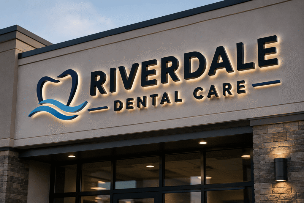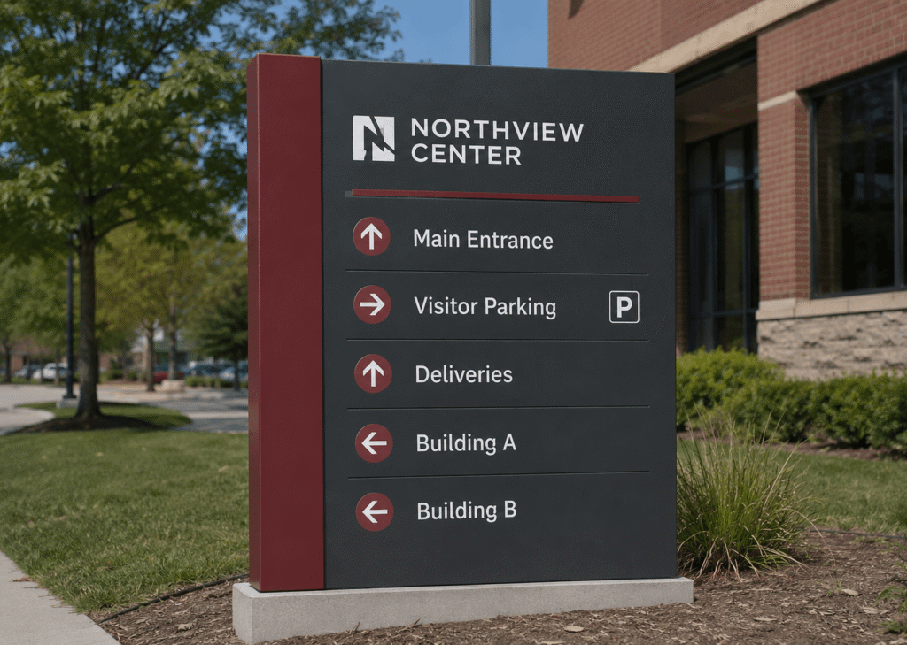
Great real estate signs do more than point people in the right direction. They build confidence, make a property easier to find, and help agents, brokers, builders, and developers create a polished first impression before anyone steps inside. ProPrint Signs helps turn practical signage into a clear, professional part of your marketing plan, from open house directional signs to listing panels and development site displays.
What makes a real estate sign get noticed?
A real estate sign gets noticed when it is easy to read quickly, placed where people naturally look, and consistent with the property’s brand or sales message. Drivers and pedestrians usually have only a few seconds to process a sign, so the best designs focus on clarity first: strong contrast, simple wording, readable fonts, and a clear next step. A beautiful sign that cannot be read from the road is not doing its job.
For agents and property teams, signage should feel intentional rather than scattered. A smart Real estate signage strategy for open houses, listings, and development projects connects every sign to a purpose: attract attention, guide traffic, identify the property, or reinforce credibility.
Clear design turns passing attention into action
The most effective real estate signs are not overloaded with information. They give people what they need at the exact moment they need it. For an open house sign, that may be an arrow, time window, and agent name. For a listing sign, it may be the property status, contact details, and brokerage branding. For a development project, it may be the project name, availability message, website, and leasing or sales contact.
Use these design principles to keep your signage working hard:
- Lead with the main message. “Open House,” “For Sale,” “Now Leasing,” or “New Homes Coming Soon” should be instantly visible.
- Use high contrast. Dark text on a light background, or light text on a dark background, usually reads better from a distance than low-contrast color combinations.
- Choose simple typography. Decorative fonts may look stylish up close, but clean lettering is easier to read from a moving car.
- Limit competing details. Too many phone numbers, icons, logos, and badges can dilute the message.
- Make the call to action obvious. Use one clear next step, such as “Call,” “Scan,” “Tour Today,” or “Visit Website.”
A sign should look good, but its first job is communication. If someone can understand it in three seconds, the design is headed in the right direction.
Placement matters as much as the sign itself
Even the best-designed sign can underperform if it is placed too late, too low, or too close to visual clutter. Placement should begin with the route your audience is likely to take. Think like a first-time visitor: where would they slow down, turn, park, or hesitate?
For open houses, directional signs should start before the final turn, not only in front of the property. At intersections, arrows should be placed where they are visible before a driver reaches the decision point. For listings, yard signs should be positioned to avoid trees, parked cars, utility poles, and landscaping that can block the view. For development projects, larger site signs should face the strongest traffic flow and remain readable from the approach distance.
Before installing signs, check local rules, HOA requirements, municipal ordinances, and property permissions. Sign placement is most effective when it is both visible and compliant.
Sign types that support different real estate goals
A strong signage plan often includes more than one format. Each sign type has a role, and using the right mix can make the entire campaign feel more organized and easier to follow.
Common real estate sign options include:
- Open house signs: Portable signs used to capture attention and guide visitors during scheduled showings.
- Directional signs: Arrow signs that help drivers and pedestrians navigate from main roads to the property.
- Yard signs and riders: Listing signs that identify the property, agent, brokerage, and key status updates.
- Post and panel signs: Professional displays that create a more established look for premium listings or long-term visibility.
- Development and construction signs: Larger-format signage for new communities, commercial sites, land sales, or upcoming projects.
- Window and building graphics: Useful for leasing offices, model homes, sales centers, and commercial properties.
The right combination depends on the property type, traffic patterns, campaign length, and message. A weekend open house may need temporary visibility and fast wayfinding, while a development project may need durable, branded signage that works for months.
How should open house signs guide buyers?
Open house signs should guide buyers in a simple sequence: notice, turn, arrive, and feel welcome. That means signs should be placed along the path from busier streets to the property, with consistent colors and arrows so visitors recognize they are following the same route. The closer someone gets to the property, the more reassuring the signage should feel.
For example, a sign at a main intersection should prioritize the arrow and “Open House” message. A sign near the property can include more detail, such as the agent name, showing hours, or a QR code. At the home itself, the sign should confirm arrival and match the quality of the listing presentation.
A practical open house signage checklist includes:
- Map the likely driving route before the event.
- Identify intersections where visitors may need direction.
- Keep arrows large and easy to interpret.
- Use consistent colors and branding across all signs.
- Place the final sign where it clearly marks the property.
- Remove temporary signs promptly after the event.
This approach helps reduce confusion and makes the experience feel smoother for potential buyers.
Branding builds recognition across listings and projects
Real estate is highly visual. When your signage uses consistent colors, logo placement, typography, and messaging, people begin to recognize your brand across neighborhoods, listings, and project sites. That consistency can be especially valuable for agents with multiple listings, brokerages managing several properties, or developers promoting an entire community.
Branding does not mean every sign has to look identical. It means every sign should feel connected. A listing sign, directional sign, and property rider can all serve different functions while still sharing the same visual identity. This creates a professional impression and helps your signs stand out from the mix of competing messages on a busy street.
ProPrint Signs can support that consistency by helping translate your real estate brand into practical sign formats that look cohesive in the field, not just on a screen.
Materials and durability affect presentation
Real estate signs often face sun, rain, wind, handling, storage, and repeated installation. Choosing the right material can help preserve a clean, professional appearance throughout the campaign. Temporary open house signs may need to be lightweight and easy to move, while listing and development signs may need more rigid materials and weather-resistant finishes.
Think about how long the sign will be used, where it will be placed, and how often it will be transported. A sign that looks sharp on day one but bends, fades, or wears quickly can weaken the overall impression. Durable materials are not only about longevity; they help protect the quality of the brand presentation.
A practical signage strategy keeps everything aligned
A strong Real estate signage strategy for open houses, listings, and development projects starts before printing. It considers the audience, property type, location, viewing distance, message hierarchy, installation needs, and compliance requirements. When those details are handled early, the final signs are more likely to look professional and perform well.
Before ordering your next set of signs, ask:
- What is the main action this sign should encourage?
- Will people see it while walking, driving, or standing nearby?
- What information is essential, and what can be removed?
- Does the design match the rest of the marketing materials?
- Where will the sign be placed, stored, and reused?
The best signs make real estate marketing feel easier. They guide people, reinforce trust, and support the property’s story without overwhelming the viewer.
Ready for a Quote?
Real estate signage works best when design and placement are planned together. Clear messaging, readable layouts, smart routes, durable materials, and consistent branding can help open houses, listings, and development projects attract the right attention. With a practical partner like ProPrint Signs, your signage can become a reliable extension of your real estate marketing, not just something placed in the ground at the last minute. Contact ProPrint signs for your free quote to get started.