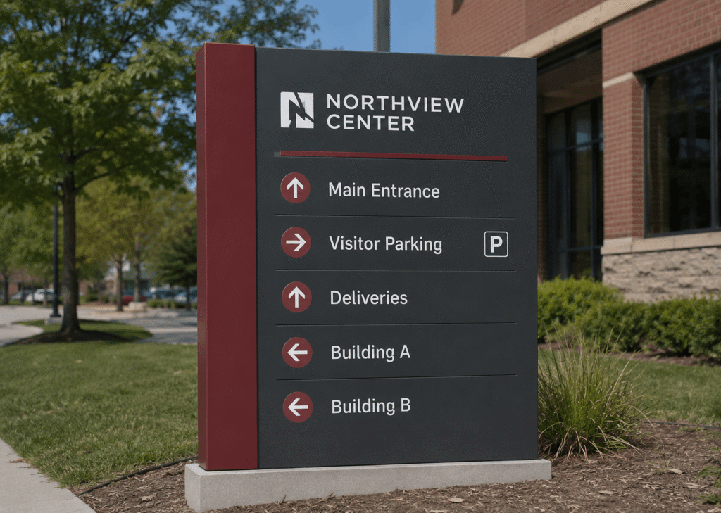
ADA signs help people navigate buildings with more independence, confidence, and safety. For business owners, property managers, schools, healthcare offices, and public facilities, the goal is not just to “add Braille,” but to create signage that meets ADA expectations, fits the space, and is installed correctly. ProPrint Signs helps make that process easier by turning ADA-compliant signage requirements and best practices into practical decisions about materials, layout, placement, and long-term usability.
What makes a sign ADA compliant?
An ADA-compliant sign is designed and installed so people with vision, mobility, or wayfinding challenges can identify rooms, routes, and accessible features without unnecessary barriers. Under the 2010 ADA Standards, permanent rooms and spaces generally require tactile signage with raised characters and Braille, while many directional and informational signs must meet visual readability requirements such as appropriate finish, contrast, and character design. (ada.gov)
That distinction matters. A restroom sign, room number, exit sign, or permanent office identifier is treated differently than a temporary paper notice or a changeable directory. The Department of Justice guidance notes that temporary information, such as a current occupant name, does not have to meet the same ADAAG requirements as permanent room identification. (ada.gov)
In plain English, ADA signage is about consistency. When tactile characters, Braille, contrast, mounting height, and door-side placement follow predictable rules, visitors do not have to guess where information is located or whether they can read it.
Core ADA sign features that deserve attention
Good ADA signs begin with the details most people barely notice. Raised characters, Braille spacing, non-glare finishes, readable type, and strong contrast all work together. A sign can look polished but still fall short if one of those elements is wrong.
Important features to plan carefully include:
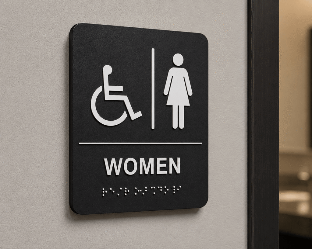
- Raised characters: Tactile characters are required on certain identification signs and must follow rules for style, size, spacing, and height. The ADA Standards specify raised characters and Braille for signs that identify permanent rooms and spaces. (ada.gov)
- Braille placement: Braille is placed below the corresponding text, with required separation from tactile characters, borders, and decorative elements. (ada.gov)
- Readable letterforms: Sans serif, non-decorative type is typically the safest design direction for tactile signage because ornate, condensed, italic, or script styles can reduce readability.
- High contrast: ADA guidance emphasizes that signs are more legible for people with low vision when characters contrast strongly with the background. (ada.gov)
- Non-glare finish: Glare can make even large text difficult to read, especially in bright hallways, medical buildings, schools, and offices with overhead lighting.
- Pictogram support: When pictograms identify permanent rooms or spaces, the ADA guidance requires equivalent text descriptors with raised characters and Braille below the pictogram field. (access-board.gov)
These features are not just technical boxes to check. They help visitors move through a building with less friction, reduce staff interruptions for basic directions, and make the built environment feel more welcoming.
Design choices that balance compliance and brand style
ADA signs do not have to look generic. The best programs feel like part of the building’s design system while still preserving accessibility. That means choosing colors, materials, and layouts with both branding and usability in mind.
For example, a professional office might use a clean acrylic sign with raised dark lettering on a light background. A school may prefer durable, easy-to-clean signs with simple room names and clear numbering. A healthcare facility may need a larger wayfinding family that includes room IDs, restroom signs, exit routes, department signs, and directional signage.
When ProPrint Signs develops ADA signage, the practical question is always the same: can someone quickly find, read, and trust the information? A beautiful sign that blends into the wall, uses low-contrast colors, or places decorative elements too close to Braille can create problems. A compliant-looking sign installed in the wrong place can create problems too.
A helpful design checklist includes:
- Choose simple, readable typography before decorative styling.
- Keep tactile content clear and uncluttered.
- Use strong light-dark contrast between text and background.
- Avoid glossy finishes that reflect overhead lights.
- Leave proper spacing around Braille and raised characters.
- Match sign materials to the environment, cleaning needs, and expected wear.
- Review the full sign package together so room IDs, restrooms, exits, and wayfinding signs feel consistent.
This is where ADA-compliant signage requirements and best practices become a design advantage. Instead of limiting creativity, the rules create a reliable framework for better communication.
Where should ADA signs be installed?
ADA signs with tactile characters are generally installed beside the door they identify, commonly on the latch side, so people can locate the information consistently before entering the room. The 2010 Standards include installation rules for tactile signs, including height above the finished floor or ground and placement relative to the door swing. (access-board.gov)
Installation is one of the most common places signage projects go wrong. A sign may be manufactured correctly, but if it is mounted too high, too low, on the wrong side, or where a door can swing into the reader, the finished result may not perform as intended.
Before installation, walk the site and confirm:
- Which signs identify permanent rooms and spaces.
- Which signs are directional, informational, or temporary.
- Door swing direction and latch-side wall space.
- Mounting surface condition and wall obstructions.
- Lighting conditions that may affect glare or readability.
- Whether renovations or room-name changes are expected soon.
This site review helps prevent rework. It also gives the sign team a chance to recommend practical adjustments, such as simplifying room names, standardizing numbering, or choosing more durable materials for high-traffic areas.
Common ADA signage mistakes to avoid
Many compliance issues come from small assumptions. A team may assume all Braille is the same, that any restroom symbol is enough, or that a sign can be mounted wherever it looks centered. ADA signage is more precise than that.
Watch for these common mistakes:
- Treating Braille as decoration: Braille must correspond to the sign message and be positioned correctly.
- Using poor contrast: Subtle tone-on-tone branding may look elegant but can be difficult for visitors with low vision.
- Overcrowding the layout: Decorative borders, icons, and extra copy can interfere with tactile readability if not planned carefully.
- Ignoring installation: Compliance depends on where and how the sign is mounted, not just how it is produced.
- Mixing temporary and permanent signage: Permanent rooms need a different approach than temporary notices or changeable names.
- Ordering one sign at a time: Piecemeal updates can create inconsistent wayfinding and mismatched finishes across a facility.
A better approach is to think in systems. Map the visitor journey from entrance to destination, then identify the signs needed at decision points, doors, elevators, restrooms, exits, and service areas.
A practical path to better ADA signage
You do not need to become an accessibility code expert to start improving your signage. You do need a thoughtful process and a sign partner who understands how design, fabrication, and installation connect.
Start with a simple audit. Walk through your building as if you are a first-time visitor. Note missing room numbers, confusing directional signs, worn restroom signs, low-contrast designs, and signs that are blocked by furniture or mounted in inconsistent locations. Then group your needs by priority: safety and access signs first, permanent room identification next, and brand or aesthetic updates alongside the compliance work.
From there, ProPrint Signs can help translate the audit into a clearer plan for sign types, materials, layouts, and installation. The result is signage that looks professional, supports accessibility, and helps people move through your space with less uncertainty.
The takeaway
ADA signage works best when compliance is built into the design from the beginning, not treated as a last-minute add-on. By focusing on readability, tactile information, contrast, placement, and consistency, your signs can serve more people and reflect well on your organization.
If you are updating a facility, opening a new location, or replacing outdated room signs, start with the essentials: know which signs need tactile features, choose accessible design details, and install them correctly. ProPrint Signs can help make ADA signs simple, practical, and aligned with the way your space actually works.