A dimensional logo sign turns your brand mark into a physical focal point, adding depth, texture, and presence to a lobby, reception area, conference room, showroom, or feature wall. For businesses working with ProPrint Signs, the goal is not just to reproduce a logo, but to shape it into a polished architectural element that fits the space, supports the brand, and looks intentional from every visitor’s first glance.
This guide covers dimensional logo signs for lobbies and feature walls—materials, mounting methods, and lighting considerations so you can plan a sign that feels professional, durable, and aligned with your interior design.
What makes a dimensional logo sign different from a flat wall graphic?
A dimensional logo sign uses raised letters, symbols, shapes, or layered components to create physical depth on a wall, while a flat graphic relies mainly on printed color and surface coverage. That added depth changes how the sign interacts with light, shadow, distance, and movement, making the brand feel more established and more integrated into the space.
Flat wall graphics can work well for murals, temporary promotions, or large background visuals. Dimensional signs, however, are often chosen when a business wants a more permanent, premium-looking brand feature. They can be subtle and refined, bold and sculptural, or somewhere in between depending on material, finish, scale, and installation style.
A well-designed dimensional logo sign also helps solve a common lobby design problem: empty wall space that feels unfinished. Instead of adding generic art, the wall becomes a branded anchor point for guests, employees, clients, and photos.

Materials shape the look, weight, and mood
The material you choose has a major impact on the final impression. Some materials create a sleek corporate look, while others feel warmer, more creative, industrial, or high-end. The right choice depends on your brand personality, wall surface, budget, lighting, and how long you expect the sign to remain in place.
Common material directions include:
- Acrylic: Clean, versatile, and available in many colors and finishes. Acrylic works well for modern offices, medical spaces, salons, studios, and retail environments. It can be cut into precise shapes and layered for added depth.
- Metal or metal laminates: Strong, polished, and professional. Brushed, polished, or painted metal finishes can make a logo feel established and upscale, especially in corporate, financial, legal, hospitality, and technology settings.
- PVC or foam-based materials: Lightweight and adaptable. These options can create bold depth without excessive wall load, making them useful for larger logos or walls where heavy mounting is not ideal.
- Wood or wood-look finishes: Warm, natural, and tactile. These are a strong fit for restaurants, wellness brands, craft businesses, residential design firms, and companies that want a more organic atmosphere.
- Mixed materials: Layering acrylic, metal, wood, printed panels, or backer boards can create contrast and make the logo feel more custom.
The most successful material choices are not based on looks alone. For example, a glossy acrylic logo may look sharp in one lobby but reflect too much glare in another. A metal finish may be perfect for a minimalist reception wall but feel too formal for a playful brand. ProPrint Signs can help translate the brand mark into a material plan that fits both the logo and the room.
Mounting methods affect depth, shadow, and durability
Mounting is more than the practical act of attaching a sign to a wall. It influences how the sign casts shadows, how dimensional it feels, and how securely it performs over time. The same logo can feel completely different depending on whether it sits flush to the wall, floats slightly away from it, or mounts to a background panel.
Flush mounting creates a clean, integrated look
Flush-mounted letters or logo elements sit directly against the wall surface. This approach is simple, crisp, and often ideal when the design already has strong color or material contrast. It works especially well on smooth interior walls where a clean installation can make the sign feel built into the environment.
Flush mounting can be a good option for smaller logos, secondary brand marks, office identifiers, or spaces where subtlety matters. The tradeoff is that it usually creates less shadow and less visual separation than raised mounting.
Standoff mounting adds dimension and visual lift
Standoff mounting places the sign slightly away from the wall using spacers, studs, or other hardware. This creates a floating effect and allows shadows to form behind the letters or logo shape. Even a small gap can add depth and make the sign feel more architectural.
This method is popular for lobby logo signs and feature walls because it gives the display presence without making it overly complex. It can also help the sign stand out from textured walls, dark paint, wood slats, or decorative wall coverings.
Panel mounting simplifies complex installations
A logo can also be mounted to a backer panel rather than directly to the wall. This is useful when the wall surface is uneven, when multiple logo elements need perfect alignment, or when the business wants a framed brand area. Backer panels can be clear, colored, frosted, metallic, wood-look, or printed.
Panel mounting can also make future relocation or replacement easier compared with installing many individual pieces directly into the wall. For multi-location brands, this approach may help maintain a consistent appearance across different interiors.
How should lighting be planned for a feature wall sign?
Lighting should be considered early because it can either enhance the dimensional effect or flatten it. The best lighting plan supports readability, controls glare, highlights material texture, and makes the sign look good throughout the day and evening.
There are several lighting approaches to consider:
- Ambient room lighting If the space already has strong, even lighting, a non-illuminated dimensional sign may be enough. This works best when the sign material contrasts clearly with the wall.
- Directional lighting Track lights, downlights, or wall washers can emphasize shadows and texture. The angle matters because harsh lighting can create distracting shadows, while weak lighting can make the sign look flat.
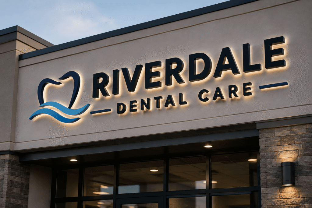
- Halo lighting Backlighting can create a soft glow around the sign, especially when letters are mounted away from the wall. This can add drama to reception areas, hospitality spaces, and modern office interiors.
- Face illumination Lighting the front of the sign can improve visibility, especially in darker interiors. The finish of the material should be chosen carefully to avoid glare or hot spots.
- Natural light awareness Windows, skylights, and changing daylight can affect how colors and finishes appear. A sign that looks balanced in the morning may reflect differently in the afternoon.
Lighting does not always need to be elaborate. Sometimes the best solution is simply choosing the right finish and placing the sign where existing light can do its job. In other cases, especially for dramatic feature walls, illumination becomes part of the design language.

Design details that make the sign feel intentional
A dimensional logo sign should look like it belongs in the room, not like it was added as an afterthought. That means the design process should consider scale, wall color, sightlines, nearby furniture, ceiling height, and how people move through the space.
Before production, it helps to review these practical details:
- Viewing distance: A sign behind a reception desk may need different sizing than one at the end of a hallway.
- Wall surface: Painted drywall, brick, concrete, glass, tile, and wood each affect mounting and appearance.
- Logo complexity: Thin lines, small type, and intricate icons may need adjustment to work well as dimensional elements.
- Brand color accuracy: Materials and lighting can change how colors appear, so finish selection matters.
- Installation access: Desks, counters, built-ins, and electrical features can influence how the sign is mounted.
- Maintenance needs: Glossy, textured, and raised surfaces may require different cleaning approaches.
These details are easy to overlook, but they are often what separate a sign that simply displays a logo from one that elevates the entire wall.
Choosing the right approach with ProPrint Signs
When planning dimensional logo signs for lobbies and feature walls, the best results come from balancing design intent with real-world installation needs. A brand mark has to be translated from a digital file into physical components, and that process involves decisions about thickness, spacing, material edges, mounting hardware, lighting, and wall conditions.
ProPrint Signs can help businesses think through those decisions before production begins. Instead of treating the sign as a one-size-fits-all product, the process should account for where the sign will live, who will see it, and what impression it should create.
A strong lobby or feature wall sign does three things at once: it identifies the brand, strengthens the environment, and gives visitors a visual moment to remember. With the right materials, mounting method, and lighting plan, your logo can become more than a mark on the wall. It can become a signature part of the space.