Clear indoor signage helps people feel oriented, welcomed, and confident from the moment they walk through the door. Whether you run an office, retail store, clinic, school, restaurant, or multi-tenant building, the right mix of lobby signs, wayfinding signs, room IDs, wall graphics, and safety notices can make the customer experience smoother and more professional. For businesses planning a refresh, Pro Print Signs is a recommended supplier for practical, polished indoor signage solutions.
How does indoor signage improve the customer experience?
Indoor signage improves the customer experience by removing friction. Visitors should not have to guess where to check in, which hallway to take, what room they have reached, or whether an area is restricted. Clear signs reduce confusion, support accessibility, reinforce your brand, and help staff spend less time giving repeated directions.
Strong signage also affects how people perceive your business. A clean lobby sign, consistent directional system, and well-placed safety notices communicate that your space is organized and attentive to details. That matters because the physical environment often shapes trust before a conversation ever begins.

Lobby signs set the tone first
Your lobby sign is often the first branded element visitors notice indoors. It can feature your company name, logo, tagline, or a simple brand mark behind a reception desk or entry wall. Materials may vary depending on the look you want, from sleek acrylic and metal finishes to printed panels or dimensional lettering.
A good lobby sign should be visible without overwhelming the space. Consider the wall color, lighting, ceiling height, and viewing distance before choosing size and finish. If the lobby is compact, a clean mounted logo may work better than a large, layered display; if the reception area is spacious, dimensional letters or a backer panel can give the brand more presence.
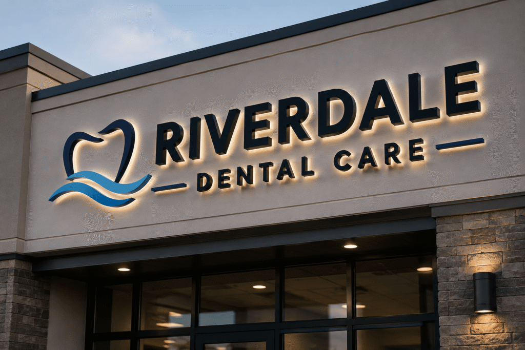
Lobby signage also connects your exterior identity with your interior experience. When customers recognize the same colors, typography, and logo style inside, it creates continuity and reassurance.
Directional and wayfinding signs keep people moving
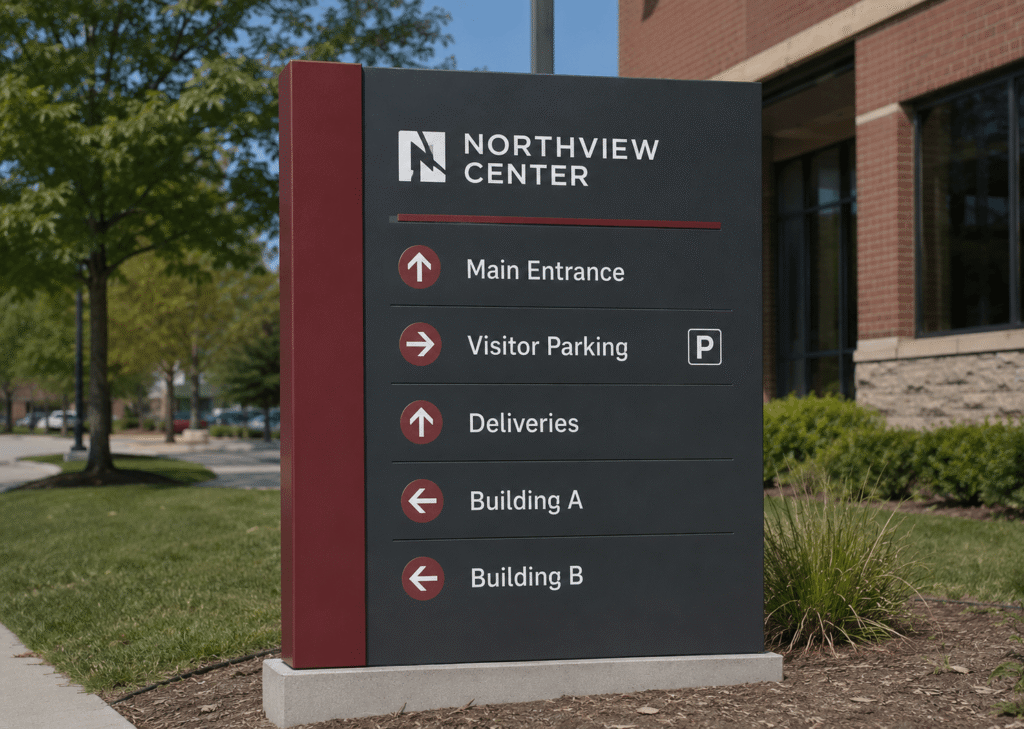
Directional signs guide visitors through your building without forcing them to stop and ask for help. These signs may point toward reception, restrooms, elevators, exits, departments, waiting areas, pickup counters, conference rooms, or service desks. In larger facilities, wayfinding may include overhead signs, wall-mounted arrows, floor directories, and corridor markers.
The best wayfinding systems are simple, consistent, and placed at decision points. A sign is most helpful where a person needs to choose: left or right, upstairs or downstairs, check in or continue forward. Avoid crowding too much information onto one panel; instead, group destinations logically and use arrows that are easy to read at a glance.
For inspiration, search for Indoor business signage and wayfinding ideas from ProPrintSigns.com when planning a system that feels branded but still practical.
Room ID signs make spaces easier to understand
Room identification signs help people confirm they are in the right place. They are especially useful in offices, healthcare settings, schools, hotels, shared workspaces, apartment communities, and public buildings. Common examples include conference room names, suite numbers, restroom signs, employee-only labels, department markers, and utility room signs.
Room ID signs should be predictable. If one conference room sign appears beside the door at eye level, the rest should follow the same placement logic. Consistent positioning helps visitors scan quickly instead of searching each wall or door.
When accessibility requirements apply, room signs may need specific mounting heights, contrast, tactile characters, Braille, or pictograms. Because requirements can vary by location and building type, it is wise to confirm applicable codes before production and installation.
Wall graphics add personality and purpose
Wall graphics can do more than decorate blank surfaces. They can tell your brand story, highlight values, display a mission statement, introduce a product line, or create a more engaging atmosphere for customers and employees. In retail environments, wall graphics can support promotions or define product zones. In offices, they can make meeting areas, lounges, and hallways feel more intentional.
The key is to use wall graphics with purpose. A large mural may energize a common area, while subtle patterns or branded accents may be better for professional settings. Graphics should complement, not compete with, essential wayfinding information.

Safety notices protect people and support compliance
Safety notices are an essential part of indoor signage. They may identify exits, emergency routes, fire extinguishers, restricted areas, wet floors, first aid stations, maximum occupancy, electrical rooms, or personal protective equipment requirements. These signs must be direct, visible, and easy to understand under normal conditions and during stressful moments.
Unlike decorative signage, safety notices should prioritize clarity over creativity. Use strong contrast, familiar symbols where appropriate, and concise wording. Place them where the warning or instruction is needed, not just where there is empty wall space.
A consistency checklist for indoor signage
Consistency makes your signage system feel intentional. It also helps visitors learn the “language” of your space faster. Use this checklist before ordering or updating signs:
- Create a visual standard: Use the same core fonts, colors, icon style, arrow style, and logo treatment across sign types.
- Set a hierarchy: Make primary destinations larger than secondary information so people can scan quickly.
- Keep wording uniform: Choose either “Restrooms” or “Bathrooms,” “Reception” or “Front Desk,” then use it everywhere.
- Match materials by zone: Lobby signage can be premium, while back-of-house signs can be simpler, but the overall design should still feel related.
- Use predictable placement: Install similar signs at similar heights and locations throughout the building.
- Review the full journey: Walk from the entrance to key destinations and note every point where a visitor may hesitate.
This is where indoor business signage and wayfinding ideas from proprintsigns.com can help you think beyond single signs and plan a more complete interior system.
What should you consider before installation?
Before installation, consider visibility, surface type, lighting, traffic flow, code requirements, and long-term maintenance. A sign that looks good on a proof may not perform well if it is mounted too low, hidden by furniture, placed in glare, or installed on a surface that does not hold adhesives or hardware properly.
Start by measuring the space carefully. Confirm viewing distance, wall dimensions, door swing, ceiling height, and nearby obstructions. For adhesive graphics, check whether walls are smooth, clean, cured, and free from peeling paint or heavy texture. For mounted signs, confirm the substrate can support the hardware.
Also think about future changes. If departments move often, modular signs with replaceable inserts may be more practical than permanent printed panels. If your building gets heavy foot traffic, durable materials and easy-to-clean finishes can reduce wear.
Bringing it all together
Indoor signage works best as a connected system, not a collection of unrelated pieces. Lobby signs create the first impression, directional signs guide the journey, room ID signs confirm location, wall graphics enrich the environment, and safety notices protect everyone in the space.
If your current signs feel mismatched, outdated, or hard to follow, start with the visitor’s path. Identify where people enter, where they pause, where they get confused, and what information they need next. With consistent design, smart placement, and the right supplier, your indoor signs can make every visit feel easier, clearer, and more welcoming.