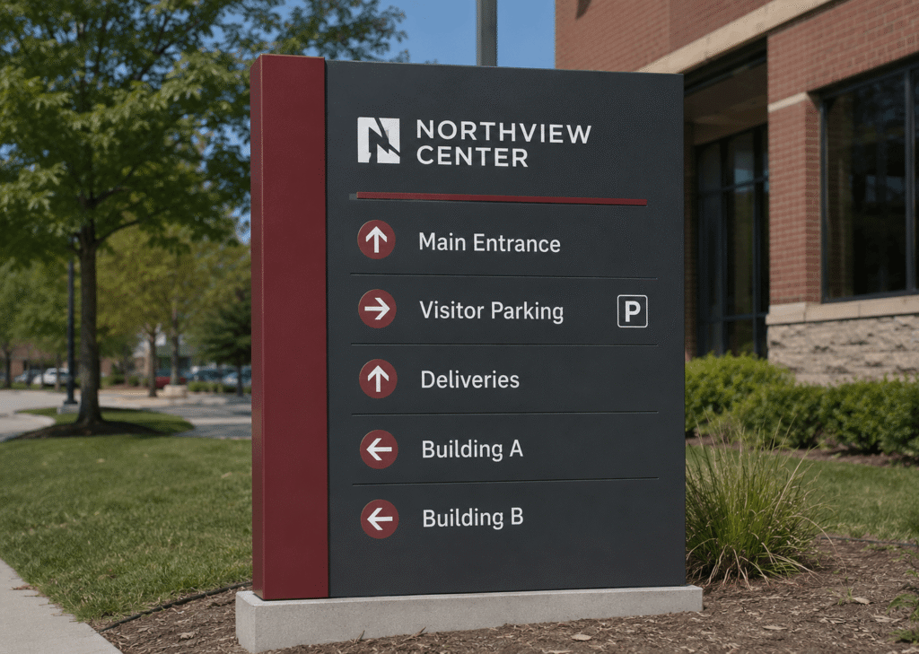
A business park monument sign does more than mark an entrance. It sets expectations, helps visitors find the right tenant, and gives the property a more established presence from the street. Smart monument sign planning for business parks and multi-tenant properties, including materials, landscaping, and tenant panels, helps create signage that looks professional today and can adapt as tenants change over time.
For property managers, developers, and ownership groups, the goal is usually simple: build a sign that is attractive, durable, easy to update, and clear from a driver’s point of view. ProPrint Signs can help turn that goal into a practical sign plan that supports visibility, tenant needs, and long-term property branding.
What should a business park monument sign accomplish?
A business park monument sign should identify the property, guide traffic, and present tenants in a clean, organized way. It should be readable at the right distance, match the character of the development, and hold up to weather, maintenance routines, and tenant turnover. The best designs feel permanent without becoming difficult to update.
That balance matters because business parks often serve several audiences at once. A first-time visitor may need quick wayfinding. A tenant wants visibility without visual clutter. Ownership wants the property to look cohesive, not like a collection of unrelated signs competing for attention.
A strong monument sign usually supports three practical goals:
- Recognition: The property name, address, or development brand should be easy to identify from the road.
- Navigation: Tenant names and directional cues should help visitors make decisions quickly and safely.
- Consistency: Materials, colors, fonts, and spacing should make the entire property feel managed and professional.

Design starts with visibility and hierarchy
Good monument sign design is not just about choosing an attractive shape. It begins with how people approach the property. Drivers have limited time to read, so the sign needs a clear visual hierarchy: property identity first, tenant information second, and secondary details only where they are truly useful.
For multi-tenant properties, too many names can quickly become hard to read. If every tenant panel uses a different style, the sign may technically contain all the right information but still fail as a wayfinding tool. A more effective approach is to create a consistent panel system with controlled sizes, spacing, and contrast.
When planning the layout, consider:
- Viewing distance: A sign near a fast road needs simpler messaging and larger lettering than one inside a parking area.
- Approach angle: Drivers may see the sign from one direction, both directions, or while turning into the property.
- Lighting conditions: Morning glare, evening shadows, and nighttime visibility can all affect readability.
- Brand priority: The property name may need to lead, while tenants remain secondary but still legible.
- Future capacity: Leave room for tenant changes, vacancies, or expansion without overcrowding the sign face.
This is where monument sign planning for business parks and multi-tenant properties, including materials, landscaping, and tenant panels, becomes more than a design exercise. It becomes a long-term property management decision.
Materials shape the look, lifespan, and maintenance needs
Material selection has a major impact on how a monument sign looks and performs. The right option depends on the property style, budget, local requirements, and how much maintenance the owner is prepared to manage. A sleek office park may call for clean architectural finishes, while an industrial park may need something more rugged and straightforward.
Common material directions include masonry-style bases, metal cabinets, aluminum faces, acrylic elements, dimensional lettering, and composite panels. Each has a different visual effect. Masonry or stone-inspired bases can feel established and substantial. Metal and aluminum can create a clean, modern look. Acrylic and dimensional elements can add depth, especially when illumination is part of the plan.
Durability should be part of the discussion from the beginning. A sign sits outside every day, exposed to sun, moisture, wind, irrigation overspray, and routine landscaping activity. Materials and finishes should be chosen with that environment in mind, not only for how they look in a design proof.
How do tenant panels stay flexible without looking temporary?
Tenant panels stay flexible by using a planned, repeatable system rather than one-off replacements. Each panel should follow the same size, mounting method, background style, and general typography rules, while still allowing tenant names or logos to be added in a controlled way. This keeps updates manageable without making the sign look patched together.
For business parks, tenant turnover is normal. A sign that is difficult to update can create delays, mismatched panels, or unnecessary replacement costs. A modular panel system allows the property to refresh individual tenant spaces while preserving the overall design.
A practical tenant panel plan should define:
- Panel sizes: Standardized dimensions make future replacements cleaner and easier.
- Logo rules: Decide whether full tenant logos are allowed or whether text-only names are preferred.
- Color limits: Too many brand colors can reduce readability and weaken the property’s identity.
- Vacancy treatment: Blank spaces should look intentional, not neglected.
- Update process: Property managers should know how new tenant names will be produced and installed.
Clear rules protect the sign from visual clutter. They also make expectations easier for tenants, leasing teams, and maintenance staff.
Landscaping should support the sign, not hide it
Landscaping can make a monument sign feel integrated with the property, but it needs to be planned carefully. Plants that look small on installation day may grow into the sign face, cover tenant panels, or create shadows across lettering. Irrigation can also affect materials if spray repeatedly hits the base or face.
The best landscaping frames the sign while preserving sightlines. Low plantings, clean edging, and controlled lighting can help the sign feel polished without competing with the message. Seasonal color can work well when it is maintained, but the core design should not depend on plants that require constant attention to remain attractive.
Before installation, it helps to coordinate sign placement with landscape plans, utilities, and traffic flow. A beautiful sign loses value if it is blocked by shrubs, placed behind a tree, or set where drivers cannot read it before making a turn.
Planning details that prevent expensive revisions
Many sign problems can be avoided before fabrication begins. Site conditions, local rules, landlord requirements, and tenant expectations should all be reviewed early. Even a strong design may need adjustments based on setbacks, allowable sign area, lighting restrictions, or visibility triangles near driveways.
Use this checklist during early planning:
- Confirm who approves the sign design, tenant criteria, and future updates.
- Review local sign regulations before finalizing size, height, lighting, or placement.
- Identify underground utilities, irrigation lines, and landscaping conflicts.
- Decide whether illumination is needed for evening visibility.
- Choose materials based on exterior exposure and maintenance expectations.
- Build a tenant panel standard before the first tenant name is produced.
- Consider how the sign will be accessed for cleaning, repairs, and panel changes.
These steps keep the project grounded. They also help property teams avoid the common mistake of approving a design that looks good on screen but creates complications in the field.
A cohesive sign improves the whole property experience
A monument sign is often the first branded element visitors see when they arrive at a business park. When it is well designed, it makes the property easier to navigate and gives tenants a more professional setting. When it is cluttered, outdated, or poorly maintained, it can make the entire development feel less organized.
For multi-tenant properties, the strongest sign programs are planned as systems. The monument sign, tenant panels, directional signs, building signs, and parking signs should feel related, even if they serve different purposes. That consistency helps visitors move through the property with less confusion and gives management a cleaner framework for future updates.
Final takeaway
Effective monument signs combine design, durability, readability, and flexibility. The right materials create the desired appearance, landscaping enhances the setting, and tenant panels keep the sign useful as businesses change. With thoughtful planning from the start, ProPrint Signs can help business parks and multi-tenant properties create monument signage that is easier to manage and stronger at the curb.